New visualizations by Kent State professor help to track coronavirus cases, risk
When Kent State professor of geology Joseph Ortiz found himself sitting at home with little to do during the early days of the coronavirus pandemic, he felt helpless. Ortiz is typically known for his research of oceanography, climate change and algal blooms—but he wanted to use his background in data analysis to educate people about the virus.
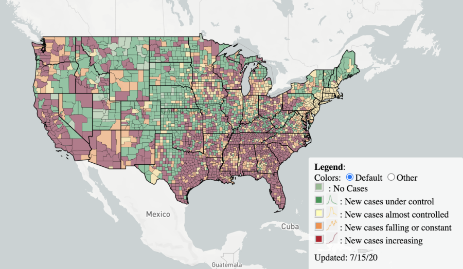
Ortiz’s frustration led to a collaboration with EndCoronavirus, a coalition of more than 4,000 volunteers, to create a coronavirus tracking site that shows trends of new U.S. cases county-by-county by using an interactive, color-coded scale.
“I happened to see one of their [EndCoronavirus] plots on social media that talked about the changes in the rate of COVID-19 in different countries, and I was intrigued by the way they had classified the different countries,” Ortiz said.
EndCoronavirus helps develop solutions for policy-makers, businesses and individuals based on the research of scientists and institutions across the world. The group shares information about the risk of COVID-19 in different areas so people can make informed decisions about going out and reopening.
To create its graphs, the group uses what is known as a time series classification, which measures how a data set changes over time. This classification focuses on the shape of the trend’s curve, and in this case, it measures how coronavirus cases change within a two-week period.
“I already had an approach to doing that kind of analysis,” Ortiz said. “It happens for my work with Lake Erie—I do a lot of work with pattern recognition and trying to identify different types of algae from space on the basis of the shape of their spectral response.”
Ortiz came up with the idea to develop a graph of coronavirus cases from a county perspective. He partnered with Olha Buchel, a postdoctoral researcher from the New England Complex Systems Institute to code the visualization using existing COVID-19 data from Johns Hopkins University, which took the team about 11 days.
“We’re taking that complicated set of numbers and providing qualitative guidance about what the trend or direction of the analysis is, and that makes it visually easy to understand so you don’t have to think about what that exact number on the number of cases means,” Ortiz said.
One map classifies counties by the trends in new cases:
-
Green = new cases under control
-
Yellow = new cases almost controlled
-
Orange = new cases falling or constant
-
Red = new cases increasing
“We look at where the current value is and compare it with where the previous maximum was,” Ortiz said. “That way we can see, is the value as large or larger than the prior max, in case it heads into the red.”
The second map shows the number of new cases per county in the last 14 days.
“Many maps are showing just the cumulative cases, and that scares people a lot. If you show cumulative cases that happened in March, they are already old cases,” Buchel said. “One day doesn’t matter. It’s important to look at the total incubation period.”
Coronavirus testing in the United States ramped up at the end of March and continued to increase, according to data compiled from Our World in Data. The Centers for Disease Control and Prevention notes that of the total coronavirus tests reported in the U.S., about 9 percent came back positive.
“That’s the opposite of what you would expect from some of the criticism that people have raised recently, is that we’re finding more cases because we’re testing more,” Ortiz said. “The proportion of people who are testing positive at this point is relatively small compared to the total number of testing.”
Despite having the largest number of confirmed COVID-19 cases in the world, much of the U.S. is still green, according to the EndCoronavirus maps.
Adopting travel restrictions and implementing mandatory periods of quarantine upon arrival would allow green zones to stay green while red zones recover, according to EndCoronavirus. And, studying cases within zip codes or counties can help officials develop more flexible strategies of reopening, Buchel said.
“We want to understand the dynamics of communities and how it correlates with COVID cases, because we think it’s a big factor,” she said.
Many states are connected by mobility patterns, which describe how people move from one place to another. Understanding where people go during their daily lives can help officials understand where the spread of coronavirus occurs, Buchel said.
“When you evaluate the data sets for places where there isn’t a lot of mobility going on, where people are listening to social distancing and wearing masks, the spread of COVID is slower in those locations than when they’re not,” Ortiz said. For example, many people are traveling to southern states, like Florida, for vacation. Most of Florida’s counties are constantly “red.”
Ortiz said data from various organizations shows the most effective way of slowing the spread of coronavirus is by following the CDC guidelines, such as wearing a mask, washing your hands, staying home if you are sick and social distancing.
Now, EndCoronavirus is working on a region-by-region visualization of coronavirus cases in countries other than the United States. Buchel developed a map for provinces in Canada, and is in the process of doing so for South America.
“We’re talking to the other teams that aren’t looking at the state and global level and thinking about ways we can incorporate other variables into trying to help people get the information they need to stay safe,” Ortiz said.
Contact Jenna Borthwick at [email protected].


